Sendible insights How to Synergise Your Holiday-Themed Social Media Content
Dressing up your social media profiles to match the holiday and season spirit is a very important marketing tactic.
And it all starts with creating a social media content calendar and featured images.
As a marketer, Halloween and the holiday season between Thanksgiving and Christmas are the perfect excuses for new campaign ideas to get your message or product out to loyal and potential customers who are ready and eager to spend.
Knowing that social media is all about visuals (both in the form of static images and videos), you might want to continue reading as we'll share some actionable tips on how to make your accounts THE place for holiday magic.
The secret behind creating holiday-themed feeds
You might've guessed it. If not, the answer is pretty simple: consistency.
And there's a reason for it.
Consistency is the key to creating a solid, omnichannel user experience.
This is why your cover images for your social media accounts and the general tone of feed posts should be consistent in feel and messaging, even if you don't use the same exact elements for each one.
If you're not keen on using advanced graphic design tools like Photoshop, Canva might just be what you're looking for.
Alternatively, you can use a platform like Pexels to find thousands of holiday-themed images that will help you maintain consistency between profiles. And yes, just like Canva, you can access this platform directly from Sendible's dashboard.
Back to designing your holiday-themed social media content.
The first thing you'll want to create is the cover photo for Twitter, LinkedIn, and Facebook.
With Canva's pre-set layouts for cover images, making the adjustments to each so that they keep that consistent feel and message is as simple as a few tweaks and can be done in less than five minutes.
And here are some things to keep in mind as you design them:
Minimal text, if any
The cover photo is the first thing a user encounters when visiting your profile. But, this doesn't mean you should include an essay in it.
This featured image is there to set the tone of your feed. So leave your crucial information in the bio section.
In case you're offering a seasonal discount, ensure to include only essential things, such as the discount and the time period. You can include everything else in your pinned post or even your bio. Just make sure to add a very clear call to action.
Now let's see how all of this works in real life.
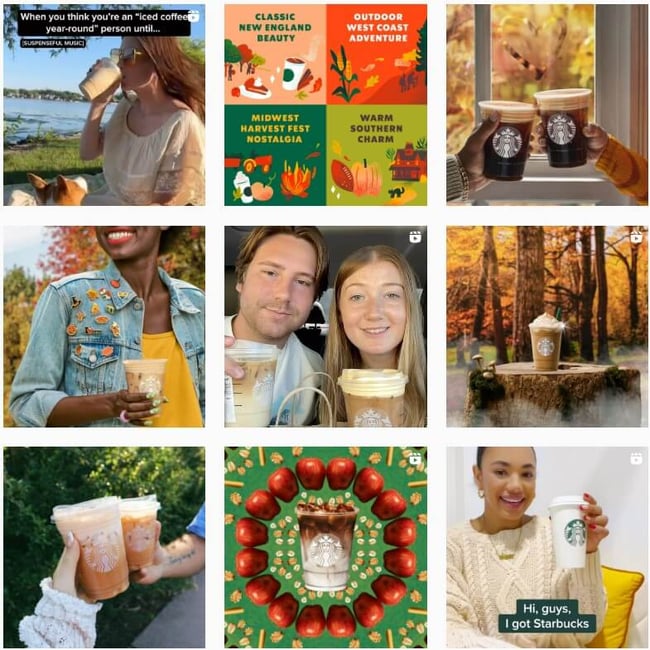
One of our all-time favourite social media dress-ups is that by Starbucks.
 Source: @starbucks
Their cover photo doesn't include any text whatsoever. Instead, they opt to place their branded cups topped with signature coffee. Additionally, they use their bio to set the tone, with a catchy phrase and the pumpkin emoji that symbolises Autumn and Halloween.
But what if you're a first-time visitor and know nothing about their signature pumpkin spice latte?
They could've made their cover image messy and packed with text. However, they opted for a much better solution and pinned a post that explains what the cups represent:
Welcome back pumpkin. 🧡 For the love of Fall, order your Pumpkin Spice Latte or Pumpkin Cream Cold Brew now. pic.twitter.com/MOTGx9zeC9
— Starbucks Coffee (@Starbucks) August 30, 2022
Stick to the safe zone
There's nothing worse than creating a beautiful holiday-themed cover image that gets covered by your profile image.
Fortunately, there's a very easy way to avoid this.
Canva has prebuilt margins that mark the safe zone, but as social media platforms' aesthetics keep changing, ensure to double-check before publishing the image.
Facebook updated the look of pages and groups, and now your profile image doesn't cover the featured image. Well, it covers it a little bit in the desktop view of pages. So make sure not to include any vital information there.
 Source: @starbucks
As you could've noticed in the previous section, the profile photo on Twitter covers a much bigger section of the featured image.
Create matchy feed posts
Once you've created your cover image, it's time to start planning your feed posts.
You'll want them to follow that main theme both in the tone of communication and visual experience. But this doesn't mean you'll have to wander off your brand guidelines. You'll still want your customers to recognise your brand whenever your content pops out in their feed.

Source: @starbucks
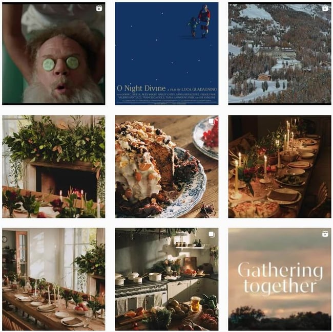
Another great example of adjusting social media posts to match the seasonal or holiday spirit is Zara Home. This brand is famous for its shabby-chic and minimalistic décor, and even though they change the lighting, set-up, colours, you'll always be able to immediately recognise their brand.
 Source: @zarahome
Create a content calendar and measure results
Brainstorming ideas and creating initial designs is one of the most beautiful parts of social media marketing campaigns.
But, don't forget to direct your creativity towards achieving measurable goals.
Ask yourself, why are you creating these posts? Is it to:
- Raise brand awareness
- Increase engagement
- Get more organic traffic to your e-shop/website
- Promote the new collection
- Get more leads
- Advertise seasonal leads
Even if it's a mix of all of the above, you'll need to create a social media calendar and track the results.
Since managing your own multiple social media platform or your clients' is time-consuming it would be best to invest in a social media management tool that allows you to find content inspiration, create and optimise posts, get approvals, and track results in one place.
Fortunately, Sendible might just be what you need.
Text copied!


