7-minute read
No intro, jump to the six reasons why we redesigned our website.
At some point in your career you have probably heard the phrase “maybe we should do a website redesign?” and if you haven’t yet, that day will come soon, I promise!
Having led phase one of our website project and done a few others throughout my career, I can reassure you that a website redesign is no silver bullet. It won't be a quick win, even though so many marketers and business owners perceive it to be.
A new website doesn’t automatically guarantee a jump in conversion rates, more whitepaper downloads or an increase in revenue. There can be complications and you need to consider the impact on SEO if you are changing the site’s structure.
However, if you do your homework (i.e. research and testing), a website redesign will propel your business forward. We want to share the reasons why we committed to this project and what we changed along the way, so you can hopefully, save time on planning and the potential headache down the line.
Comparing the period between April-September, we have seen an increase of 41% in trials year-on-year with a mere 10% increase in traffic, showing the impact and value in optimizing our website.
There are several explanations as to why you could want to redesign your website. Maybe your visitors aren't converting or the bounce rates are too high. Maybe your website doesn't reflect your business goals and vision any longer, or worse - it's not mobile friendly.
Digging deep and understanding your reasoning and the needs of your buyer personas is essential before you even think of reaching out to web development agencies.
Is a website redesign really necessary?

You might have heard that a website redesign should be done every three years or so. But when should you really do it? And is it really worth the time, stress and expense?
Your website can be a major source for leads and revenue and if it isn't, it might be time to take a close, hard look at how it's performing. Your prospects visit your website to decide whether to buy from you and if they aren't satisfied, they will leave and quickly forget about it.
88% of online consumers are less likely to return to a site after a bad experience. (Source: Case study by Gomez)
If you give them a nice experience, they might be swayed to visit your pricing page and, in our case, start a trial.
We saw an opportunity for our website to perform significantly better by creating landing pages with Unbounce, so we decided we needed that kind of flexibility to exist on our site.
Our new website was developed in two stages by a London-based agency, Highrise Digital that specializes in WordPress CMS. They created a completely bespoke WordPress template for us that is virtually all customizable from the back-end. You can read about the project and our experience with Keith and Mark in this case study.
Prior to this, our in-house Product Designer (UX/UI), Stefano D’Avascio mapped out the Information Architecture (IA), built the prototype boards, created visual assets. After the site was developed and moved to a staging site by Highrise Digital, Stefano optimized it. His advice on starting a website redesign project follows below.
What is the first thing you need to do?
First things first, gather data on the current user journey and map out everything.
Plan the project and set priorities for your end goals, but keep in mind that the User's needs are the primary focus, so make sure they always match.
Create prototypes to better understand what the new website needs to be to match all requirements. User testing is the right (and best) way to see if the created architecture works for what the user is looking for.
Remember, the User defines your failure or success - use data and feedback to create the perfect journey for your user.
What are the challenges you can expect?
Restyling a website is a delicate process. Changing the IA could cause discrepancies with well-ranked pages on search engines - so you can use them as milestones to build the new architecture and improve ranking for other pages later.
Another challenge is consistency between products. Keeping your branding, copy and product consistent isn’t as easy as it may seem, but it can only benefit your brand.
So, why did we redesign our website? There are six solid reasons but above all, we wanted our new website to reflect our values as a company and put us in a position to serve our customers the best we can.
Our six reasons for doing a website redesign

1. To communicate our brand values better
Sendible is all about helping other companies achieve social media success. Instead of focusing on the value or the solution our tool provides our old website copy focused on what the product was instead. That information is fine for techies, but not so great for marketers who don’t know our story.
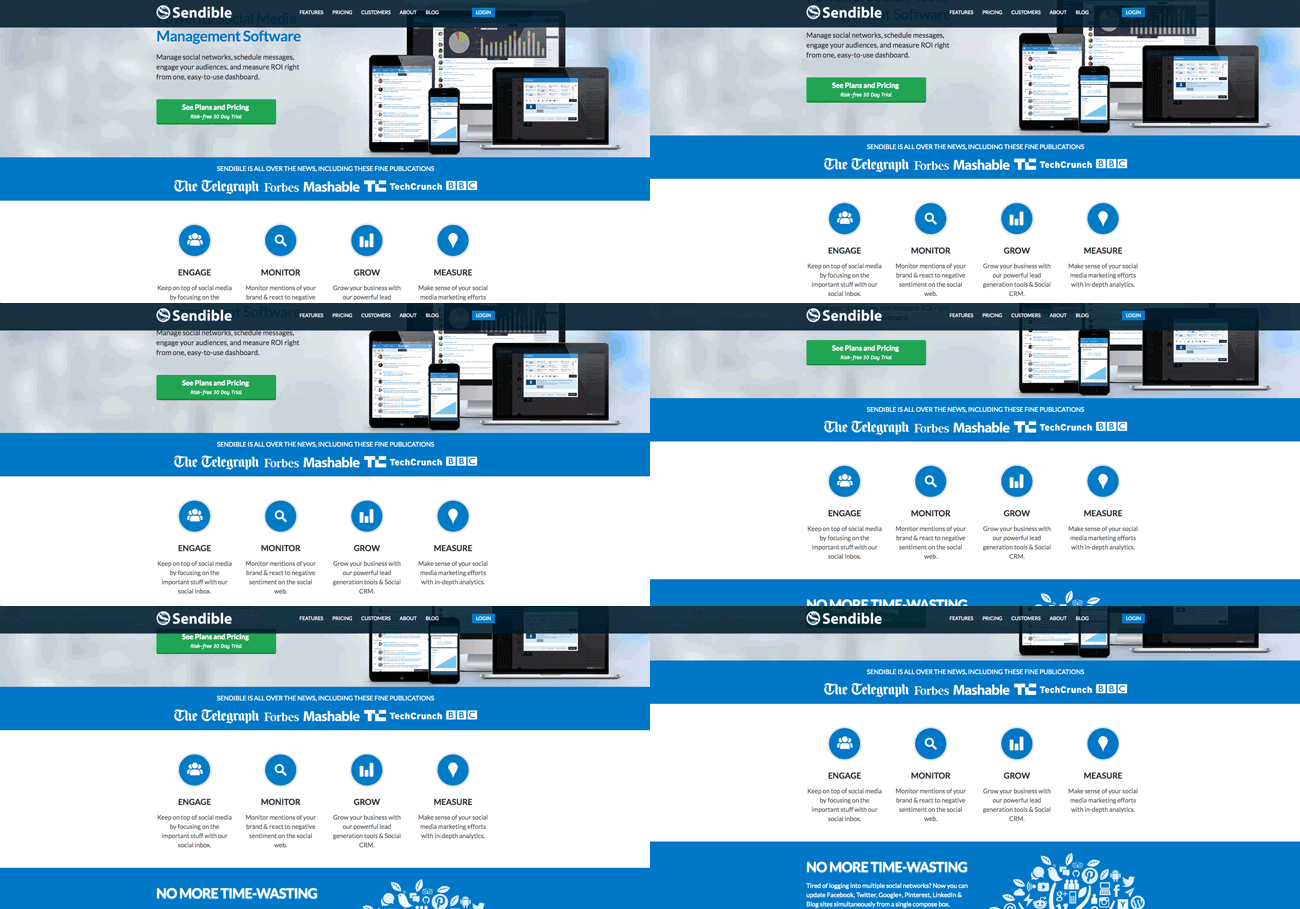
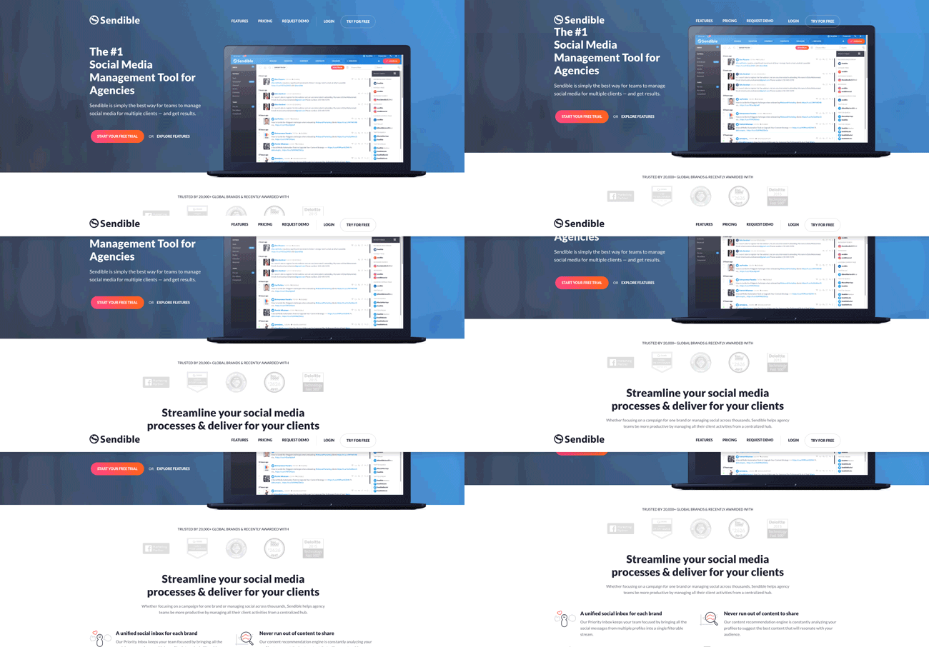
We rewrote all of the copy as part of the website redesign, keeping value to our users top of mind. Each section of the website mirrors the ones in our tool, making it simple to navigate and understand. It is a fresher, brighter look with visual cues as to how our tool can help you be more productive on social media.
After few months of tests, we started phase two of our redesign project, led by our Customer Success Manager, Rachel Orr. This time around we focused on visual styling improvements and adding some more back-end functionality and the result is what you can see today.
The redesign of the website also helped us move our rebranding project further. Our logo, marketing collateral, social media presence, online adverts, support site, blog and eventually, the actual desktop app have all been revamped.
2. To improve website usability for our visitors
If you have a ‘brick and mortar’ store, you aim to keep it presentable and welcoming. The same story applies to your online site. With the new website, we hoped to improve our site structure and the user journey. To do this, we focused on telling a story that connected our core USPs (unique selling points) with the pains and challenges of our customers.
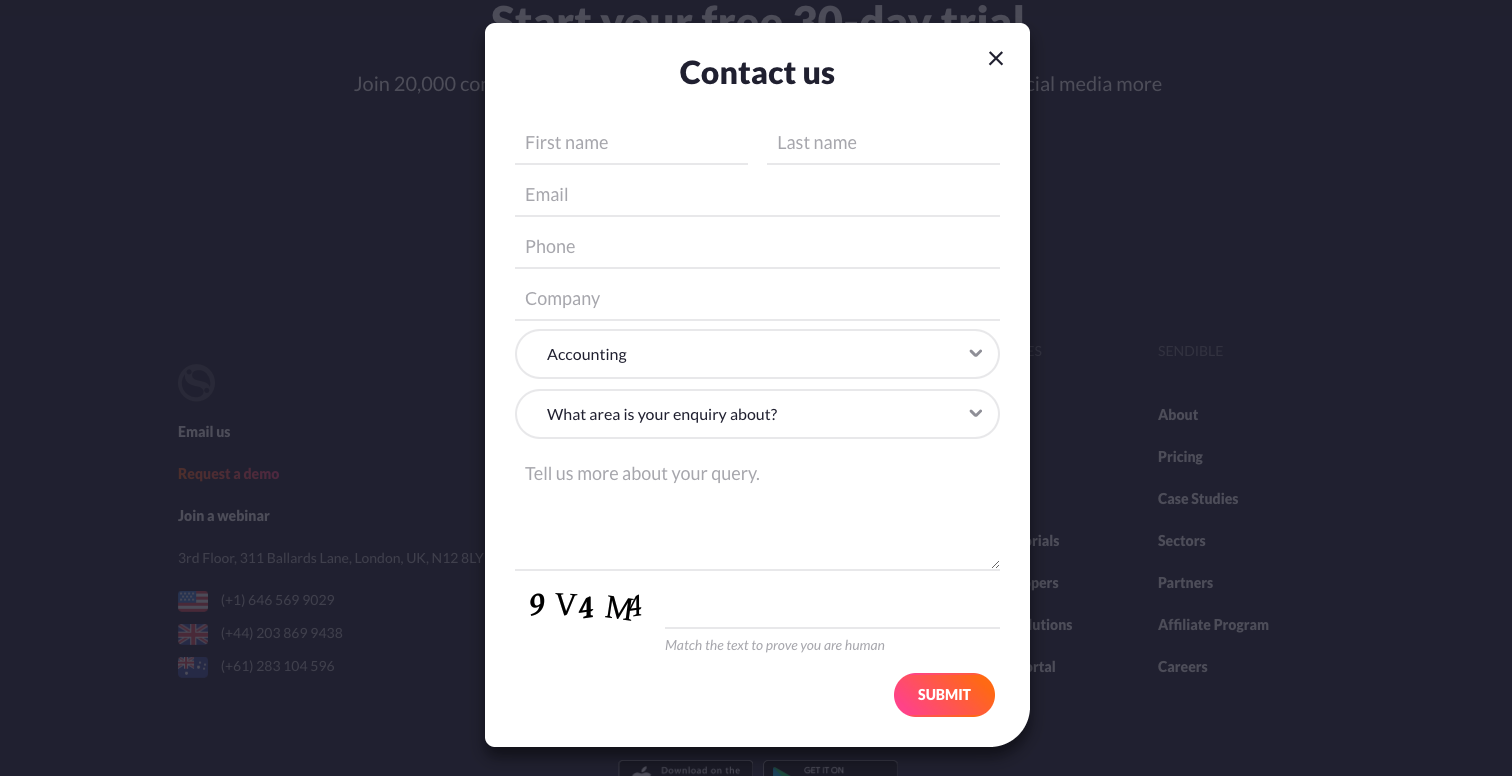
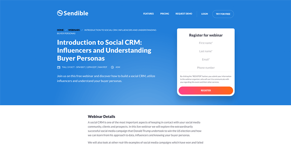
We added brand new sections to the site, allowing users to browse through our extensive library of webinars and register for product walkthroughs to learn about social media best practices from our team and partners. We also introduced contact forms to make it simpler for prospects and customers to get in touch with us and receive responses as quickly as possible.
3. To improve usability and flexibility for our marketing team
Creating a new landing page, changing the formatting or sequence of page elements and adding new assets are all crucial tasks for testing your site’s performance and improving conversion rates. But not all content management systems (CMS) are as accessible from the back-end, and marketing teams often feel limited by needing to ask developers for help.
The back-end of our old website didn’t support the flexibility that we required to manage all content, especially when we introduced new features for our tool or wanted to perform tests to make improvements.
Since our marketing team wanted full control, we needed a website that would allow us to create, test and manage as many elements as possible. This was where our website developers went above and beyond to create a website that didn't just look good but was also easy to manage.
4. To improve SEO and site performance
While our old website had detailed menus, our pages were mainly image-based and the overall length of the copy and the number of inbound links was lacking heavily. The website structure was tedious for some users as well as for search engines. To counter this, we analyzed our best performing, high-value pages and used them as the cornerstones for our new website structure.
It’s ideal to have an experienced web developer or a technical SEO expert to help you in the process. But if you don’t, there are plenty of resources online that can help guide you, including painless website migration tips and advice on performing an SEO audit to check rankings. It’s also wise to do a full link audit before launching your new website.
5. To improve the quality and volume of the leads generated
Inbound leads are important to our marketing funnel, so we wanted to generate more high-quality leads by improving our website and strategy. To do this, we expanded on the type of content that lived on the site. We revamped the case studies section, introduced video tutorials and added lead generation forms to our webinars.
After a few months of testing, we confirmed that knowing your buyer personas is crucial for improving conversion rates. With tools like Optimizely, you can A/B test your website pages and only make changes when you know they will work with the majority of your visitors. We saw an increase in conversion rates every time we changed the copy to specifically target our ideal customers. So do lots of testing, before and after you redesign your website.
6. To facilitate integrations with external software
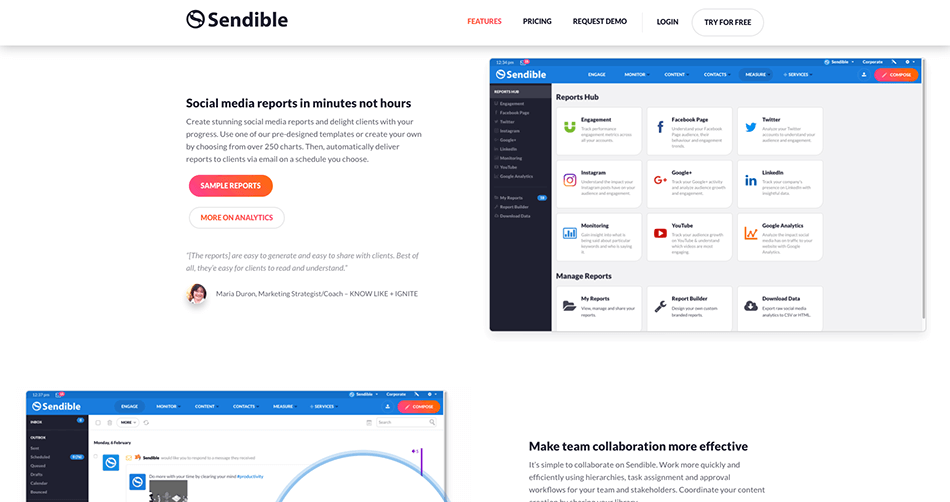
Last but not least, we wanted to make our website compatible with all of the tools that we currently use to improve data capture, testing and user experience. For example, integrating with SalesForce allows us to feed all captured data straight into our CRM, which makes it easier for our consultants to get back to prospects.
We also integrated with a live chat tool and added an integration with our webinar software provider, making it simpler for our attendees to register and watch the webinar recordings afterwards.
Spending less time on admin tasks is one of the best pieces of advice we can give! There are quite a few marketing technologies that can help you do just that - especially useful if you are working with a lean team.
Over to you
There are many reasons why you could want to do a website redesign or migration. Understanding the ‘why’ and planning the project while keeping user experience and function front of mind is what worked for us
Whenever your website doesn't perform as it should, be it because of design, conversions or general feedback issues, it's an opportunity to improve. Testing concepts and new page designs before making drastic changes can help you get a good grasp on what your final spec will look like.
Have you done a website redesign recently? What were your reasons and what tips can you give to our readers? Share them in the comments section below.

