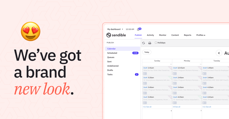
We're thrilled to unveil a transformation that's been in the works - a brand-new theme for your Sendible experience. Say goodbye to the old and embrace the new as we present an updated look to your Sendible dashboard. 🥳
🎨 Out with the old, in with the new
If you've been with us for a while, you might have noticed a certain "retro charm" in Sendible's appearance. But we believe in the power of evolution, and it's time for a fresh perspective that better matches our branding for a more cohesive experience for all of our users.
We've given our in-app colour palette a makeover, infusing it with a burst of modern and vibrant hues. The result? An interface that's not only more accessible and pleasing to the eye but also seamlessly aligned with our brand identity.

🖥What hasn’t changed
While the colours have changed, the heart of Sendible remains untouched. Your trusted dashboard, features, and tools are all right where you expect them, ready to empower your social media marketing.
💭Why the change?
We're all about growth, and we believe that a fresh coat of paint can do wonders for your digital creativity, in addition to improving the accessibility and usability of our app.
Our new theme reflects our dedication to ensuring that Sendible continues to evolve and enhance your user experience while maintaining a seamless and intuitive interface.
🚀 Explore the new dashboard
Ready to explore the new theme? Simply log in to your Sendible account and immerse yourself in the updated colours and design.
If you’re not already a customer, you can try Sendible for free for 14 days right here. 👈
💡Your feedback matters
We hope you enjoy this release! In the meantime, please reach out to our support team if you have any questions.
Head over to our Feedback Portal with any other requests, we’re ready to keep improving Sendible for you.


