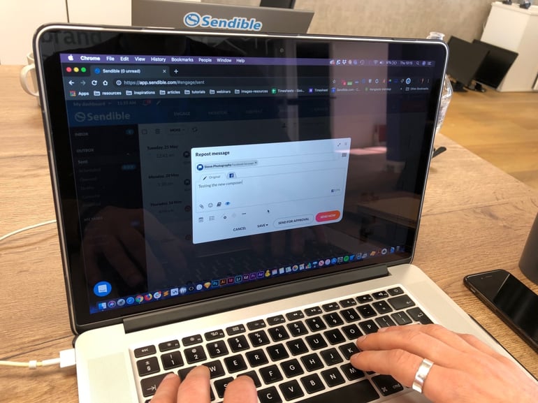
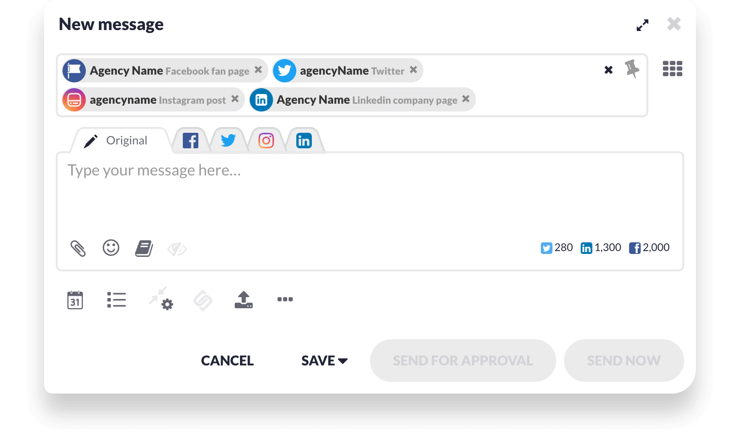
We're excited to announce that we've introduced a new toolbar within the Compose Box! 👏
One of the ways our Product Team prioritises what to work on next is by reviewing the ideas our customers leave on our feedback portal.
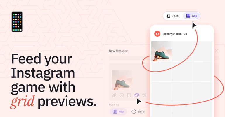
Most of our users told us they wanted the ability to preview posts before they're published so that they can be confident they'll look good on each of the social media platforms they're posting to.
When trying to figure out what this solution could like, we realised that we would need to add a new Post Preview button to the Compose Box. However, we already had 8 buttons in a row and adding a 9th would simply add clutter and detract from the user experience. 🤪
Our product designer, Stefano, explains how we approached this problem:
Mitigating risks ⚖
The Compose Box is our most heavily used feature, with thousands of users relying on it for crafting their social media content every day. So, it was super important that whatever change we made here, it would not impact on our customers' workflow in any way.
Our top priority was to maintain the user friendliness of the Compose Box whilst not adding any additional cognitive overhead on the users' part.
So, to give us confidence, we decided to conduct user research with as many users as possible. Our product team spent hours in customer interviews, showing them multiple prototype variations of the new Compose Box layout to validate our ideas.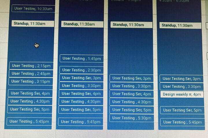
Following our research, we decided that a new toolbar was needed.
So, what's changed? 🤷♀️
If we've done our homework right, you shouldn't notice any changes. However, if you're a heavy Sendible user, the first thing you might notice is that the Attach Button has now moved to the toolbar.
From our user testing, we noticed that some people spent a couple of seconds looking for it, but once they found it, its new position just seemed natural.
Why you should be excited 😄
By introducing the new toolbar within the Compose Box, we can now ensure that all the actions to do with the content of the post itself are grouped together.
This layout change also opens the door for us to add even more exciting features in the coming months, including:
- Instagram location tagging
- Instagram first comment
- Reusable hashtags
What do you think of the new toolbar? We'd love to hear your feedback!
